If you walk into a shop and decide to buy something, you know you need to head over to the checkout to pay for it. With a website, it’s not always that obvious. There are no physical checkouts and not all businesses sell products online.
Here’s the thing: if customers don’t know how to do business with you, they won’t and they’ll just leave your website.
That’s why you need to add a clear call-to-action (CTA) to your website. A CTA tells visitors exactly what action to take and how to take it – it asks for the sale! Including a CTA increases the likelihood that customers will do business with you.
Here are some tips on creating a CTA that works:
- Keep it simple and short (2-3 words)
- Use words like ‘Now’ or ‘Today’ to create a sense of urgency
- Use action words like ‘Buy’ or ‘Book’ to motivate customers to click
- Make sure it stands out by using a bold colour – red, orange, or green work well
- Make sure it gets seen by repeating it multiple times on your website
- Only have one main CTA – more than one will confuse visitors!
Good CTA Examples:
- Buy Now
- Book A Call
- Get A Quote
- Reserve Today
- Schedule A Meeting
Bad CTA Examples:
- Learn More
- Get Started
- Sign Up
- Subscribe
- Contact Us
- Not having a CTA!
You’re not done yet! Having a clear CTA is one thing. Getting customers to click on it is another matter entirely. You need to strategically place your CTA to make sure customers see it. Add it to the top right corner of your website as part of your navigation. Your navigation should be stripped of any non-essential links (‘About Us’, ‘FAQ’, ‘Why choose us?’, etc.). For maximum impact, you wouldn’t have any links in your navigation other than your CTA.
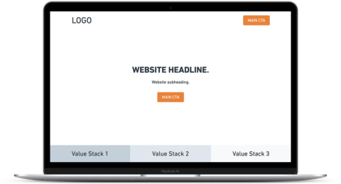
You should also include your CTA in the centre of your website header (the top of the homepage visible without scrolling down) underneath your headline and subheading. In fact, it’s important to repeat your CTA multiple times on your website. Research suggests people need to see something 8 times before they remember it. We want people to remember your CTA, so be generous with it.
Don’t be afraid to add it to every section of your homepage and other pages on your website. It won’t seem pushy. Customers will appreciate how easy it is to do business with you and you’ll appear confident.
It’s time you asked for the sale! Add a clear call-to-action (CTA) to your website and watch your patient list increase!
Get clear and take action!
Mike Hennan
Co-founder, PatientBoost
P.S. Need help with your website? Book a call!
P.P.S. That’s an example of a CTA!